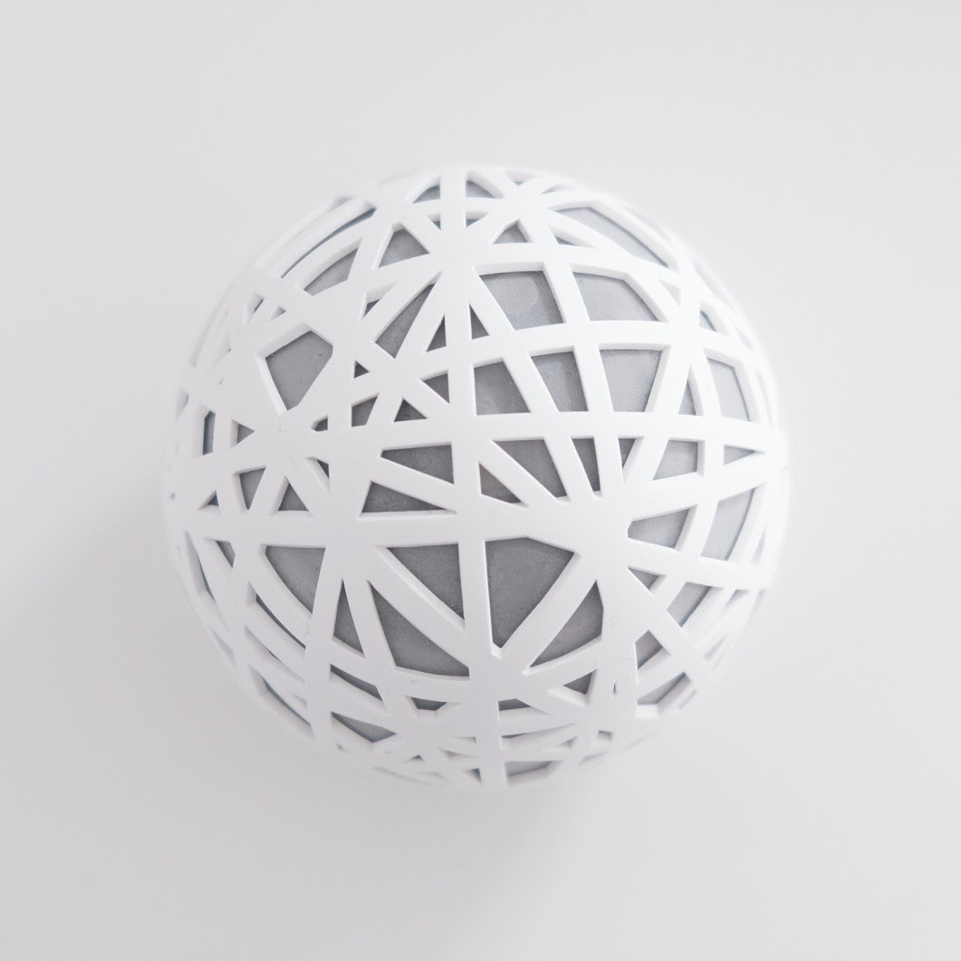
The Sense is still one of my all-time favourite product designs. It reminds me a lot of the Beijing National Stadium by Herzog & de Meuron.
Unfortunately, the Sense never delivered on any of its other promises: The app UI wasn’t great, the personalised sleep insights & recommendations didn’t feel right and they never released the API they promised in their Kickstarter campaign. A few months ago the company announced it was shutting down. The email with instructions on how to export your data? I’m still waiting for it. My Sense is now nothing but an expensive paperweight.

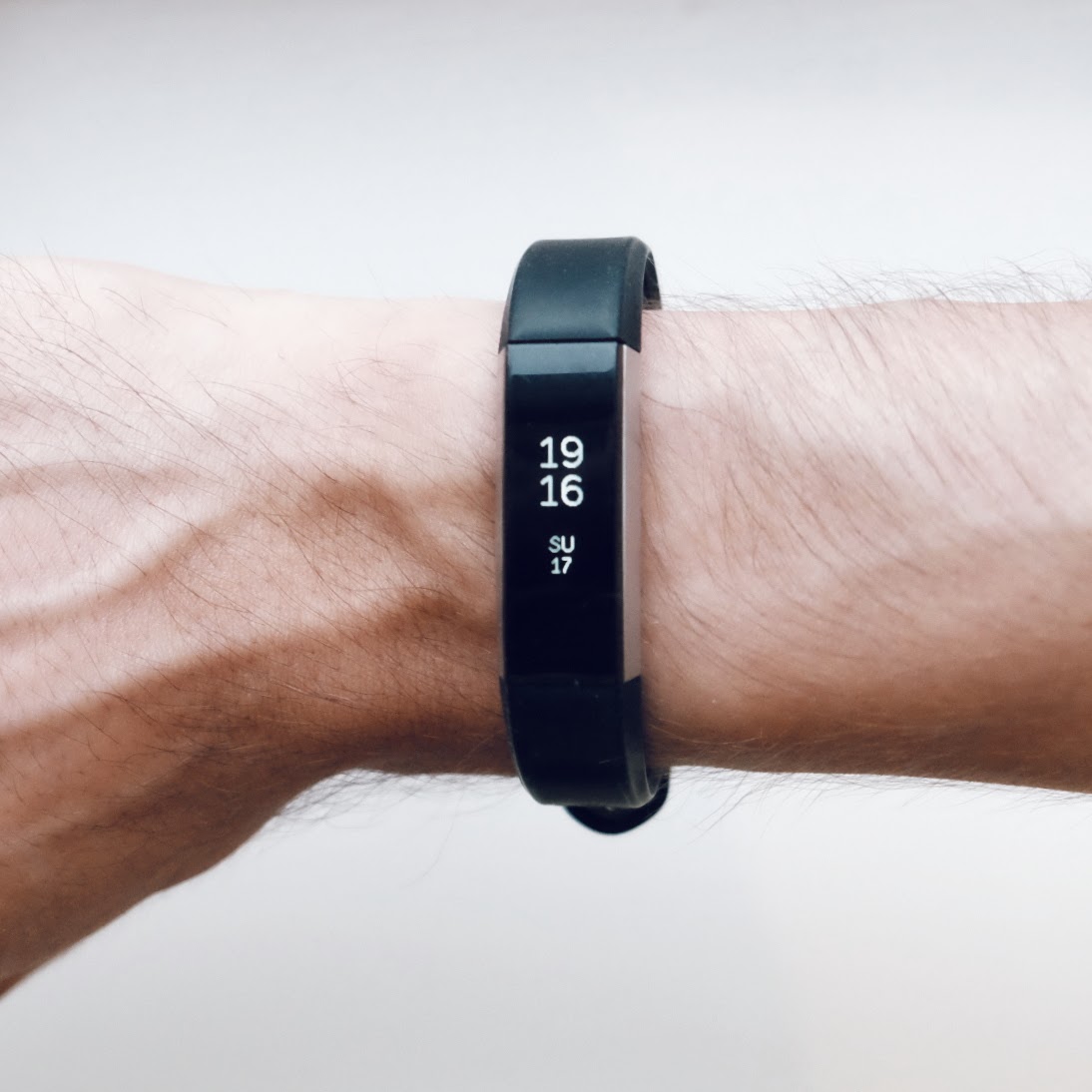
There seems to be an interesting trend with quantified self devices: They either look great but don’t perform well (see Sense, Jawbone Up, Vessyl), or they perform well but lack good design (see Garmin, Zeo, Fitbit).
Fitness trackers in particular will need both great design and additional functionalities beyond step tracking to stay relevant, which is why the latest Fitbit release was so disappointing: The Ionic is not exactly a stylish piece of fashion. The form follows function approach would be okay if the watch had any ground-breaking new tracking capabilities, but that doesn’t seem to be the case either.
The winner seems to be the Apple watch, which both looks nice (I really like the Nike+ version) and offers pretty decent fitness tracking. Then on the other hand: No proper sleep tracking since the battery doesn’t even last 24 hours …
I’ll keep waiting for a device that gets both form and function right.