> Hello
> My name is Julian
> This is my lifelog
>
and digital playground  

The case against conversational interfaces

01 Intro

Conversational interfaces are a bit of a meme. Every couple of years a shiny new AI development emerges and people in tech go “This is it! The next computing paradigm is here! We’ll only use natural language going forward!”. But then nothing actually changes and we continue using computers the way we always have, until the debate resurfaces a few years later.

We’ve gone through this cycle a couple of times now: Virtual assistants (Siri), smart speakers (Alexa, Google Home), chatbots (“conversational commerce”), AirPods-as-a-platform, and, most recently, large language models.

I’m not entirely sure where this obsession with conversational interfaces comes from. Perhaps it’s a type of anemoia, a nostalgia for a future we saw in StarTrek that never became reality. Or maybe it’s simply that people look at the term natural language” and think “well, if it’s natural then it must be the logical end state”.

I’m here to tell you that it’s not.

02 Data transfer mechanisms

When people say “natural language” what they mean is written or verbal communication. Natural language is a way to exchange ideas and knowledge between humans. In other words, it’s a data transfer mechanism.

Data transfer mechanisms have two critical factors: speed and lossiness.

Speed determines how quickly data is transferred from the sender to the receiver, while lossiness refers to how accurately the data is transferred. In an ideal state, you want data transfer to happen at maximum speed (instant) and with perfect fidelity (lossless), but these two attributes are often a bit of a trade-off.

Let’s look at how well natural language does on the speed dimension:

The first thing I should note is that these data points are very, very simplified averages. The important part to take away from this table is not the accuracy of individual numbers, but the overall pattern: We are significantly faster at receiving data (reading, listening) than sending it (writing, speaking). This is why we can listen to podcasts at 2x speed, but not record them at 2x speed.

To put the writing and speaking speeds into perspective, we form thoughts at 1,000-3,000 words per minute. Natural language might be natural, but it’s a bottleneck.

And yet, if you think about your day-to-day interactions with other humans, most communication feels really fast and efficient. That’s because natural language is only one of many data transfer mechanisms available to us.

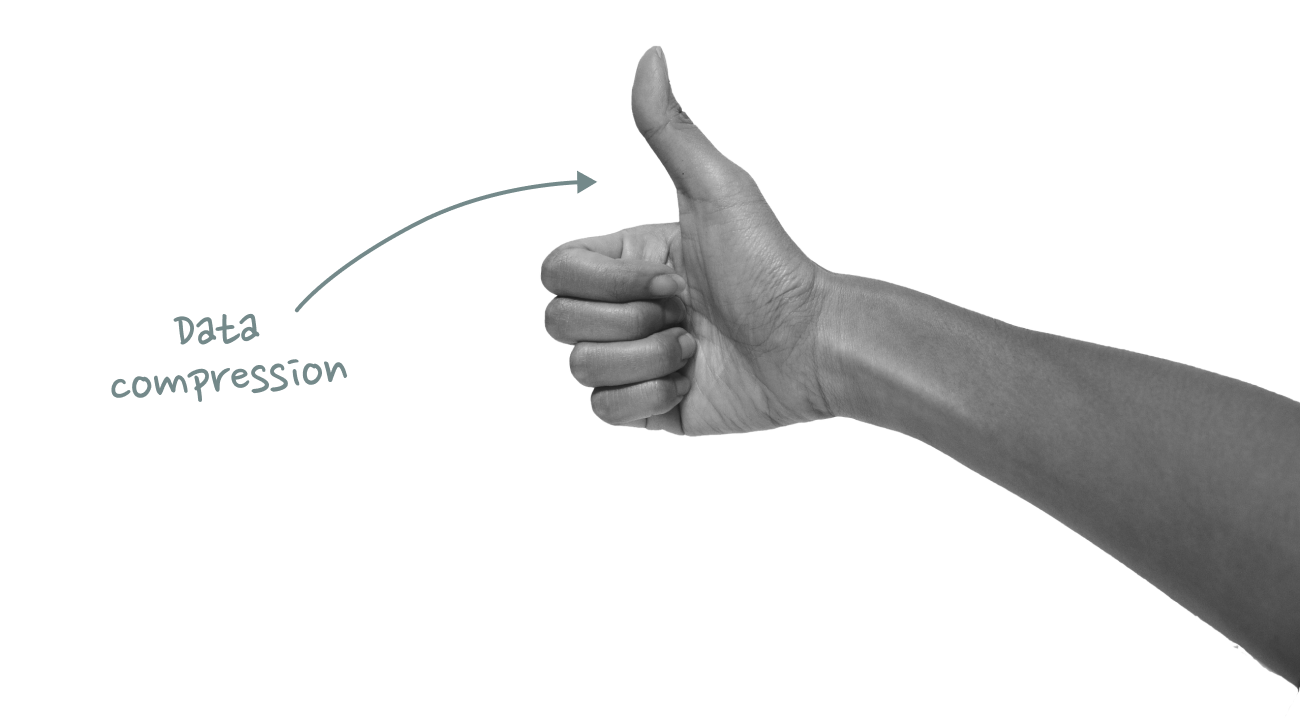
For example, instead of saying “I think what you just said is a great idea”, I can just give you a thumbs up. Or nod my head. Or simply smile.

Gestures and facial expressions are effectively data compression techniques. They encode information in a more compact, but lossier, form to make it faster and more convenient to transmit.

Natural language is great for data transfer that requires high fidelity (or as a data storage mechanism for async communication), but whenever possible we switch to other modes of communication that are faster and more effortless. Speed and convenience always wins.

My favorite example of truly effortless communication is a memory I have of my grandparents. At the breakfast table, my grandmother never had to ask for the butter – my grandfather always seemed to pass it to her automatically, because after 50+ years of marriage he just sensed that she was about to ask for it. It was like they were communicating telepathically.

*That* is the type of relationship I want to have with my computer!

03 Human Computer Interaction

Similar to human-to-human communication, there are different data transfer mechanisms to exchange information between humans and computers. In the early days of computing, users interacted with computers through a command line. These text-based commands were effectively a natural language interface, but required precise syntax and a deep understanding of the system.

The introduction of the GUI primarily solved a discovery problem: Instead of having to memorize exact text commands, you could now navigate and perform tasks through visual elements like menus and buttons. This didn’t just make things easier to discover, but also more convenient: It’s faster to click a button than to type a long text command.

Today, we live in a productivity equilibrium that combines graphical interfaces with keyboard-based commands.

We still use our mouse to navigate and tell our computers what to do next, but routine actions are typically communicated in form of quick-fire keyboard presses: b to format text as bold, t to open a new tab, c/v to quickly copy things from one place to another, etc.

These shortcuts are not natural language though. They are another form of data compression. Like a thumbs up or a nod, they help us to communicate faster.

Modern productivity tools take these data compression shortcuts to the next level. In tools like Linear, Raycast or Superhuman every single command is just a keystroke away. Once you’ve built the muscle memory, the data input feels completely effortless. It’s almost like being handed the butter at the breakfast table without having to ask for it.

Touch-based interfaces are considered the third pivotal milestone in the evolution of human computer interaction, but they have always been more of an augmentation of desktop computing rather than a replacement for it. Smartphones are great for “away from keyboard” workflows, but important productivity work still happens on desktop.

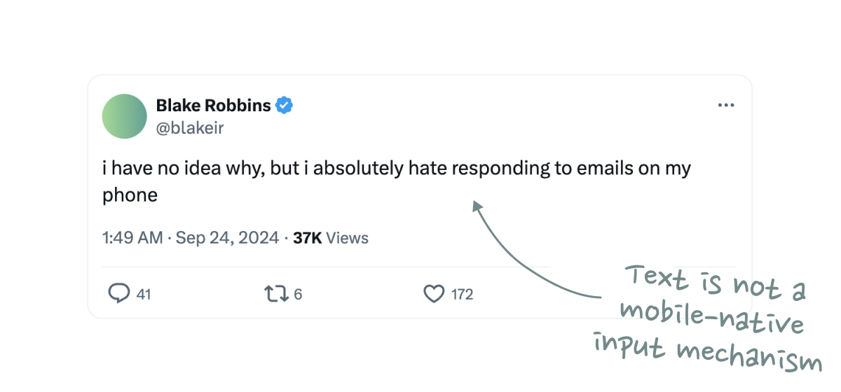
That’s because text is not a mobile-native input mechanism. A physical keyboard can feel like a natural extension of your mind and body, but typing on a phone is always a little awkward – and it shows in data transfer speeds: Average typing speeds on mobile are just 36 words-per-minute, notably slower than the ~60 words-per-minute on desktop.

We’ve been able to replace natural language with mobile-specific data compression algorithms like emojis or Snapchat selfies, but we’ve never found a mobile equivalent for keyboard shortcuts. Guess why we still don’t have a truly mobile-first productivity app after almost 20 years since the introduction of the iPhone?

“But what about speech-to-text,” you might say, pointing to reports about increasing usage of voice messaging. It’s true that speaking (150wpm) is indeed a faster data transfer mechanism than typing (60wpm), but that doesn’t automatically make it a better method to interact with computers.

We keep telling ourselves that previous voice interfaces like Alexa or Siri didn’t succeed because the underlying AI wasn’t smart enough, but that’s only half of the story. The core problem was never the quality of the output function, but the inconvenience of the input function: A natural language prompt like “Hey Google, what’s the weather in San Francisco today?” just takes 10x longer than simply tapping the weather app on your homescreen.

LLMs don’t solve this problem. The quality of their output is improving at an astonishing rate, but the input modality is a step backwards from what we already have. Why should I have to describe my desired action using natural language, when I could simply press a button or keyboard shortcut? Just pass me the goddamn butter.

04 Conversational UI as Augmentation

None of this is to say that LLMs aren’t great. I love LLMs. I use them all the time. In fact, I wrote this very essay with the help of an LLM.

Instead of drafting a first version with pen and paper (my preferred writing tools), I spent an entire hour walking outside, talking to ChatGPT in Advanced Voice Mode. We went through all the fuzzy ideas in my head, clarified and organized them, explored some additional talking points, and eventually pulled everything together into a first outline.

This wasn’t just a one-sided “Hey, can you write a few paragraphs about xprompt. It felt like a genuine, in-depth conversation and exchange of ideas with a true thought partner. Even weeks later, I’m still amazed at how well it worked. It was one of those rare, magical moments where software makes you feel like you’re living in the future.

In contrast to typical human-to-computer commands, however, this workflow is not defined by speed. Like writing, my ChatGPT conversation is a thinking process – not an interaction that happens post-thought.

It should also be noted that ChatGPT does not substitute any existing software workflows in this example. It’s a completely new use case.

This brings me to my core thesis: The inconvenience and inferior data transfer speeds of conversational interfaces make them an unlikely replacement for existing computing paradigms – but what if they complement them?

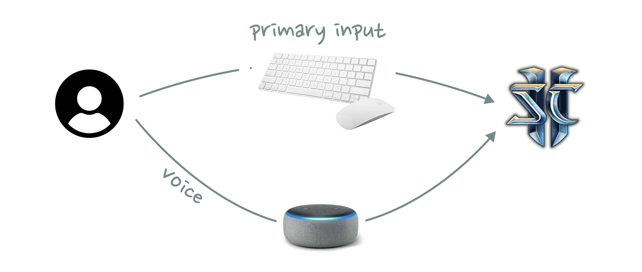
The most convincing conversational UI I have seen to date was at a hackathon where a team turned Amazon Alexa into an in-game voice assistant for StarCraft II. Rather than replacing mouse and keyboard, voice acted as an additional input mechanism. It increased the bandwidth of the data transfer.

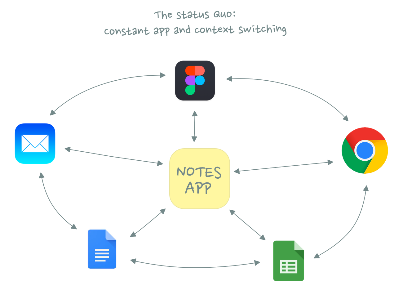
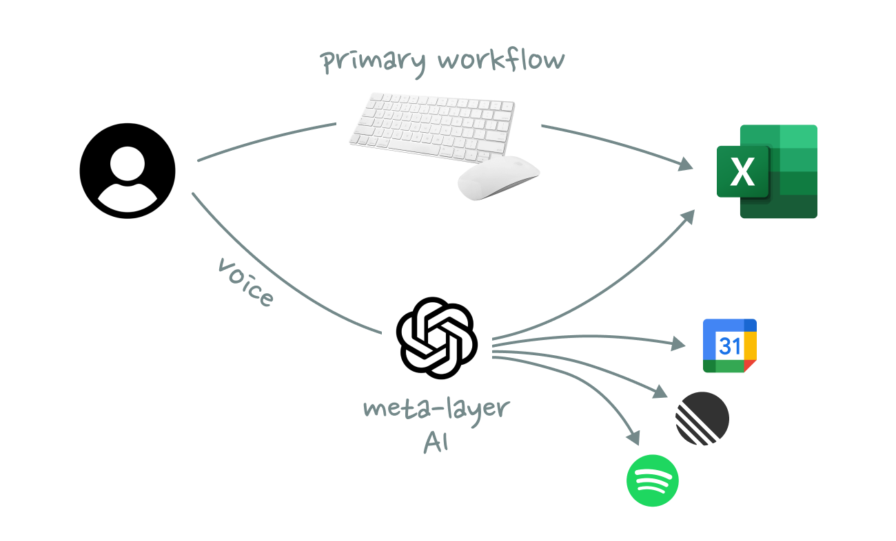
You could see the same pattern work for any type of knowledge work, where voice commands are available while you are busy doing other things. We will not replace Figma, Notion, or Excel with a chat interface. It’s not going to happen. Neither will we forever continue the status quo, where we constantly have to switch back and forth between these tools and an LLM.

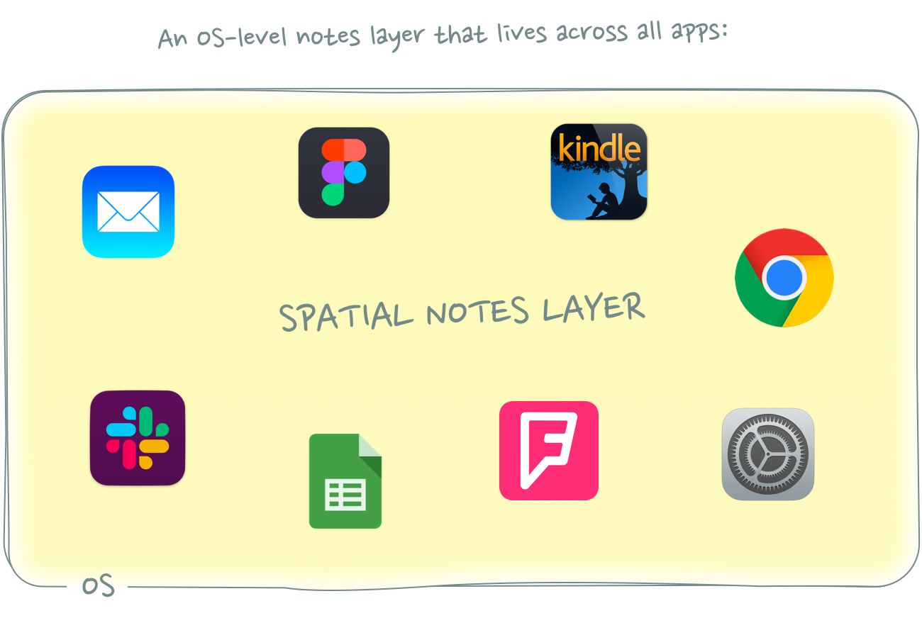
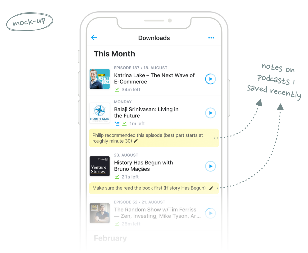
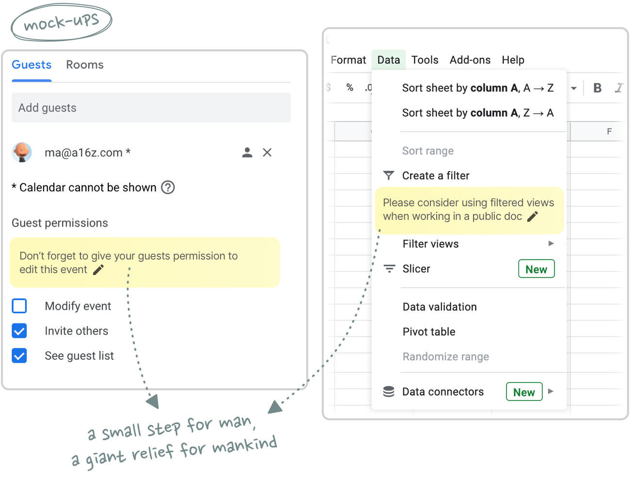
Instead, AI should function as an always-on command meta-layer that spans across all tools. Users should be able to trigger actions from anywhere with simple voice prompts without having to interrupt whatever they are currently doing with mouse and keyboard.

For this future to become an actual reality, AI needs to work at the OS level. It’s not meant to be an interface for a single tool, but an interface across tools. Kevin Kwok famously wrote that “productivity and collaboration shouldn’t be two separate workflows”. And while he was referring to human-to-human collaboration, the statement is even more true in a world of human-to-AI collaboration, where the lines between productivity and coordination are becoming increasingly more blurry.

The second thing we need to figure out is how we can compress voice input to make it faster to transmit. What’s the voice equivalent of a thumbs-up or a keyboard shortcut? Can I prompt Claude faster with simple sounds and whistles? Should ChatGPT have access to my camera so it can change its answers in realtime based on my facial expressions?

Even as a secondary interface, speed and convenience is all that matters.

05 Closing thoughts

I admit that the title of this essay is a bit misleading (made you click though, didn’t it?). This isn’t really a case against conversational interfaces, it’s a case against zero-sum thinking.

We spend too much time thinking about AI as a substitute (for interfaces, workflows, and jobs) and too little time about AI as a complement. Progress rarely follows a simple path of replacement. It unlocks new, previously unimaginable things rather than merely displacing what came before.

The same is true here. The future isn’t about replacing existing computing paradigms with chat interfaces, but about enhancing them to make human-computer interaction feel effortless – like the silent exchange of butter at a well-worn breakfast table.

Thanks to Blake Robbins, Chris Paik, Jackson Dahl, Johannes Schickling, Jordan Singer, and signüll for reading drafts of this post.

Mar 27, 2025  ×  Berlin, DE

A Meta-Layer for Notes

What’s the digital equivalent of sticky notes?

01 Hey

This was originally supposed to be a blog post about Hey. I wanted to write a longer essay about Basecamp’s new email tool and test if the app actually lives up to its hype.

After playing around with it for a few weeks, my conclusion is this: Hey’s most interesting aspect is not its radical approach to email – but its fresh approach to note taking!

We have long treated notes as a distinct silo in our productivity stack, when we should have integrated them right into our workflows instead. While email might need an overhaul, I see a way bigger opportunity in rethinking digital note taking.

So instead of my Hey review, let’s talk about notes and my idea for a radically new kind of note taking app.

02 A Closer Look at Notes in Hey

Hey has two interesting notes features.

The first are so-called Thread Notes. These are basically emails to yourself within an email thread that only you can see. You might have seen similar internal notes features in shared inbox tools like Zendesk or Front. Thread Notes in Hey are effectively the single player version of those.

I’d find Thread Notes super useful in combination with snoozed emails: “Show me this email again in [insert time] and remind me of [insert note]”

This feels like a way better workflow than adding a note in a separate reminder, to-do, CRM, or note taking app.

a) Because there’s no need for context/app switching.
b) You might not even remember that you took a note related to an email when it resurfaces in your inbox a few weeks later.

To-do and reminder apps (and calendars!) work great for tasks that are tied to a specific day or time. But many tasks – and especially notes – are not dependent on time. Their relevance is based on other trigger points. Only when certain conditions are met, should these notes resurface: “If [insert event] is true, then show [note]”

In the case of our email, the note becomes relevant in [insert snooze time] or whenever the recipient replies to the email thread. The fact that many tasks have external dependencies (which are usually linked to an email thread) is one of the reasons I believe that your email inbox should also be the place where you manage your to-dos. You shouldn’t need a separate to-do app.


The second note feature in Hey are Inbox Notes.

As the name suggests, these notes are added to individual emails in your inbox. Similar to Thread Notes, you can use them to quickly jot down things you need to remember, but they also help you to highlight specific emails.

Thread Notes and Inbox Notes feel similar, but they serve two slightly different use cases. Thread Notes work more like reminders (“Don’t forget X when you reply”), whereas Inbox Notes feel more like bookmarks that highlight the most important messages in a long list of emails.

Together, they remind me of one of my all-time favorite note taking tools: Post-it Notes.

03 Post-it Notes

I’m a huge fan of physical note taking and there are two writing tools that I use every single day: A physical notebook (for longer thoughts, including first drafts of my blog posts) and post-it notes (for all kinds of quick notes).

(Disclaimer: When I say “post-it notes” I’m referring to all types of sticky notes, not just those sold by 3M.)

Post-it notes serve two of the same functions that Hey’s note features offer: highlights and reminders.

One of the reasons I still read a lot of non-fiction in physical book form is because it’s easier to bookmark and annotate passages that I quickly want to find again later. Similar to Thread Notes, sticky note bookmarks help me highlight the most important items in a long list.

Apart from helping you find important passages in a book later on, sticky note bookmarks also allow you to add additional context to the section you highlighted (e.g. *why* you bookmarked a particular section or thoughts you had about it).

You could write down notes like this in a separate notebook, but then you’d lose the connection to the source they are based on. What makes post-it notes so interesting is the spatial relationship between the notes and their respective context.

It’s this spatial relationship that also make post-it notes great reminders.

Post-it note reminders are similar to Hey’s Thread Notes in that they are triggered not based on time but on events that don’t have a (forecastable) deadline. They are essentially like notifications that appear when you look at specific objects.

A post-it note on your front door, for example, is like a notification that pops up when you’re about to leave the house: “Before you go, don’t forget to [insert note]”. A shopping list on your fridge is a data request notification that surfaces when you are most likely to have new items to add to your list.

Together, post-its essentially become a notes layer that augments the real world. Instead of a physical notebook that lists all your notes and tasks in chronological order, post-it notes are scattered around your house but tied to specific places or objects where they are most relevant.

The question is: Why isn’t there a digital note taking tool that works like this?

04 A Spatial Note Taking Layer

There are dozens of great note taking apps out there: Evernote, Google Keep, Apple Notes, Workflowy, Notion, Roam … the list goes on and on. Every one of these tools has its own unique angle on note taking, but they all have one thing in common: They are stand-alone apps.

This strikes me as suboptimal. Neither the creation nor the consumption of notes should be treated as separate workflows.

As John Palmer points out in his brilliant posts on Spatial Interfaces and Spatial Software, “Humans are spatial creatures [who] experience most of life in relation to space”. Post-it notes are so powerful because they have a spatial relationship to their context.

Many notes shouldn’t live in a dedicated note taking app that you explicitly have to open and search. Notes should emerge automatically whenever and *wherever* they are most relevant.

As long as note taking remains separated, users constantly have to switch back and forth between different applications, which is not ideal. It reminds me of the recent discussion around productivity and collaboration – which have historically also been treated as two separate, isolated workflows:

The platonic flow of productivity should minimize time spent not productive, with collaboration as aligned and unblocking with that flow as possible. By definition, any app that requires you to switch out of your productivity app to collaborate is blocking and cannot be maximally aligned. It’s fine to leave your productivity app for exceptions and breaks. But not ideal when working.

The same applies to notes. You shouldn’t have to switch apps and context to take or consume notes. It should stay within the same workflow!

(Side Note: You could argue that note taking is essentially single-player collaboration where you communicate with your future self – but that’s a whole new discussion I’ll save for another blog post.)

Natively built in note taking features like email notes in Hey feel like a good step in the right direction – but email is just one distinct silo in your productivity stack. Imagine you had to buy different sets of post-it notes for every single room or object in your house.

What we need instead is a spatial meta layer for notes on the OS-level that lives across all apps and workflows. This would allow you to instantly take notes without having to switch context. Even better yet, the notes would automatically resurface whenever you revisit the digital location you left them at.

Let’s look at a few examples.

05 Examples

One use case that immediately came to mind when I thought about spatial notes is bookmarking.

Most of us don’t use just one bookmarking app for everything. We use different bookmarking apps or bookmarking features depending on the type of object we want to save for later: Podcasts are usually saved in a dedicated podcast app, for example. Articles are bookmarked in Pocket, books on Goodreads, songs on Spotify, places on Foursquare, products on Amazon … you get my point.

Bookmarks are great to remember *what* you want to revisit later – but not *why* you saved something in the first place. I would love to be able to add notes to my bookmarks directly in each app so that I have some context on why these objects are important when I return to them later.

Ideally, these notes wouldn’t just show up in the one place I originally left them, but across all apps and websites that reference the (semantic) object I bookmarked. A note attached to a book I want to read in Goodreads, for example, should also emerge when I see that book in my Amazon search results – or when someone mentions it in my Twitter timeline.

People are a similar type of semantic object you could tie notes to. Instead of a stand-alone CRM tool, you would leave a note attached to a person straight from your current workflow (e.g. your email client). That note would then automatically re-surface whenever the person it references becomes relevant again:

  • When you’re in an email thread with them
  • When you add them to a calendar event
  • When you’re visiting their LinkedIn page
  • When you look them up in your phone book
  • etc


Another use case for spatial notes are instructions on how to use specific software features or improve workflows. These could be quick reminders to add permissions to new calendar events or to use Filtered Views in Google Sheets. You could also use these notes to train users on keyboard shortcuts.

You could imagine employers shipping corporate laptops with pre-installed notes to make it easier to transfer (previously tacit) knowledge and thus improve the onboarding process for new hires.

06 Closing Notes

I could go on and on about potential use cases for a spatial note taking app. The possibilities are endless – but blog posts shouldn’t be. So I’ll end things here.

A final note before you leave: I’d love to hear your thoughts on this whole idea. What would you use a spatial note taking tool for? Let me know what you think in this Twitter thread!

Thanks to Kevin Yien, Matthew Achariam, Max Cutler and Nathan Baschez for their detailed feedback on drafts of this post.

If you liked this post, you might also enjoy the following essays:

Sep 04, 2020  ×  Berlin, DE

Emoji as a Platform Moat

There have been a few reports recently about Apple rejecting apps which make use of Apple’s emoji set outside of the keyboard.

I find this very surprising. Emojis are a completely underrated platform moat, in my opinion.

Android and iOS have become more and more similar and there are hardly any switching costs left for consumers:

  • Both operating systems offer pretty much the same features
  • You have high-end devices for both platforms (most importantly equal camera quality)
  • All major apps are available for both iOS and Android
  • Switching from iOS to Android literally doesn’t take more than a few minutes

This leaves Apple with only handful advantages over Android:

  • New apps are usually released on iOS first (temporary exclusivity)
  • Apps which are only available on iOS, most importantly iMessage
  • And: Emojis

Android has several emoji-problems:

I don’t have data to back this up, but I’m pretty sure there are psychological switching costs because you feel partly excluded from the conversations you are having with your iOS-friends (especially in group chats).

So Apple should embrace the use of its emoji set as much as possible, but prohibit developers from using them in their Android apps (which I assume has happened in the case of WhatsApp and Slack).

It’d be great if someone would come up with an open-source set of great looking emoji that become the standard across all platforms.

Feb 15, 2018  ×  Berlin, DE

Form vs. Function

The Sense is still one of my all-time favourite product designs. It reminds me a lot of the Beijing National Stadium by Herzog & de Meuron.

Unfortunately, the Sense never delivered on any of its other promises: The app UI wasn’t great, the personalised sleep insights & recommendations didn’t feel right and they never released the API they promised in their Kickstarter campaign. A few months ago the company announced it was shutting down. The email with instructions on how to export your data? I’m still waiting for it. My Sense is now nothing but an expensive paperweight.

There seems to be an interesting trend with quantified self devices: They either look great but don’t perform well (see Sense, Jawbone Up, Vessyl), or they perform well but lack good design (see Garmin, Zeo, Fitbit).

Fitness trackers in particular will need both great design and additional functionalities beyond step tracking to stay relevant, which is why the latest Fitbit release was so disappointing: The Ionic is not exactly a stylish piece of fashion. The form follows function approach would be okay if the watch had any ground-breaking new tracking capabilities, but that doesn’t seem to be the case either.

The winner seems to be the Apple watch, which both looks nice (I really like the Nike+ version) and offers pretty decent fitness tracking. Then on the other hand: No proper sleep tracking since the battery doesn’t even last 24 hours …

I’ll keep waiting for a device that gets both form and function right.

Sep 17, 2017  ×  Dublin, IE
You can subscribe to this blog via RSS, follow me on Twitter or sign-up for email notifications: