It has now been more than six weeks since I have last been to the office. 48 days to be exact. Like everyone else on this planet, I spent the majority of the last few weeks in the confines of my own four walls – with the occasional trip to the supermarket down the road.
Instead of writing yet another “Here are 8 tips to stay productive at home” article, giving you an update on my sourdough skills (hint: good), or my progress with Animal Crossing (hint: not so good), I thought I’d spend some time looking at my Quantified Self data and write up a Quarantine QS Report instead.
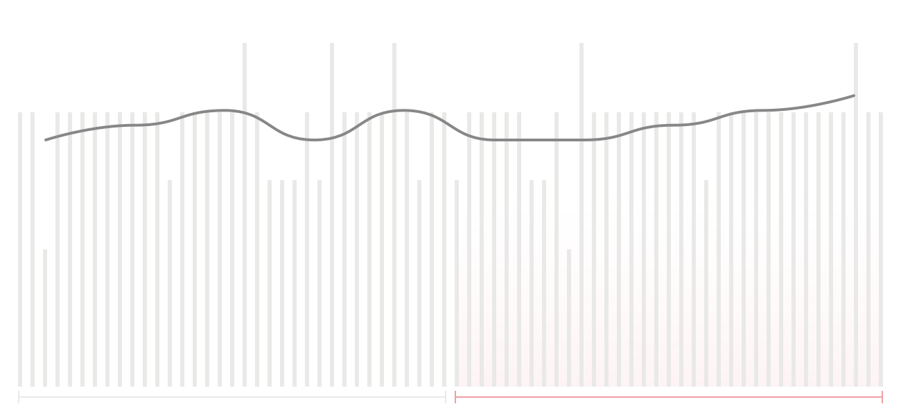
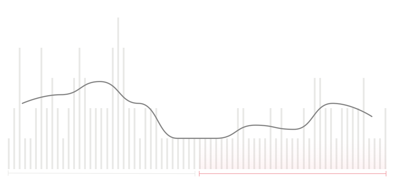
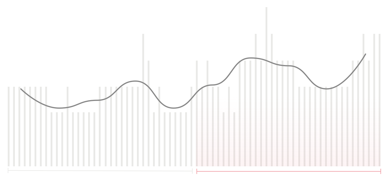
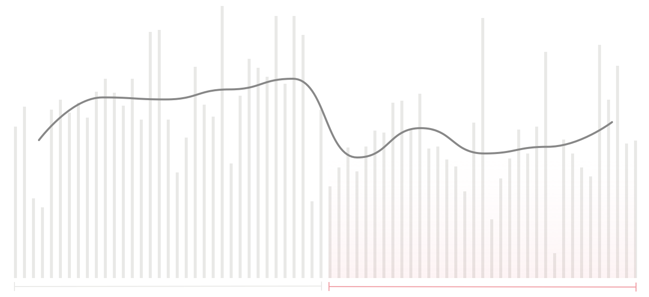
The graphs and statistics in this article look at the ten weeks between February 5, 2020 and April 13, 2020. They compare the first five weeks of quarantine with the five weeks before the lockdown.
If you have feedback or questions on anything in this report, give me a shout.
02 Mental Wellbeing
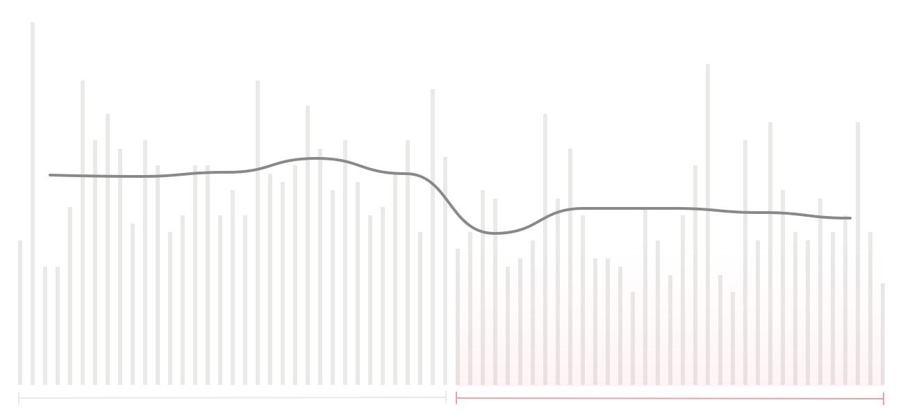
The good news first: So far, the quarantine hasn’t had any negative impact on my mental wellbeing. My reported daily happiness levels have on average remained almost the same (Average: 3.86 → 3.89).
fig 01Perceived Happiness
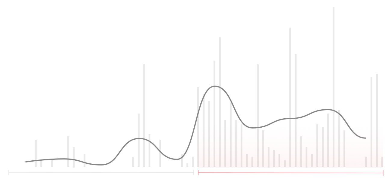
My stress levels have decreased by almost 30% since the start of the lockdown (Average: 2.11 → 1.51). I assume that this is due to less in-person meetings.
fig 02Perceived Stress
03 Physical Wellbeing
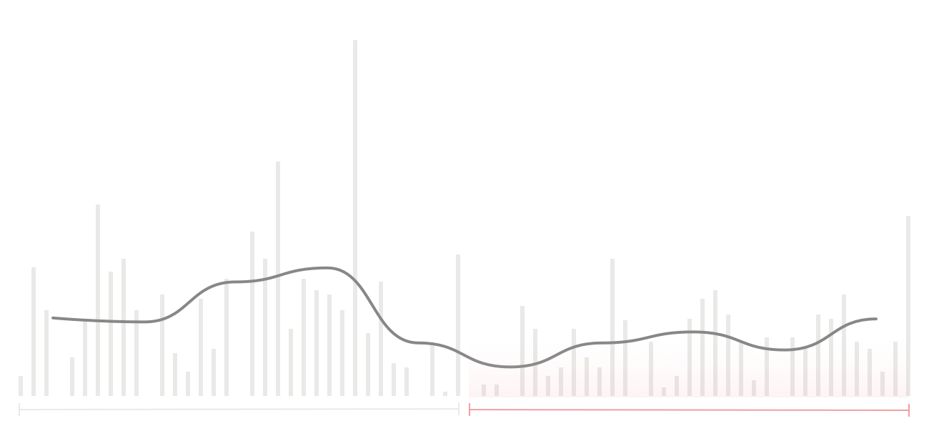
While the lockdown didn’t impact my mental wellbeing, it has had a severe impact on my physical wellbeing. My perceived backpain has increased by more than 37% in the last few weeks (Average: 2.69 → 3.69).
fig 03Perceived Backpain
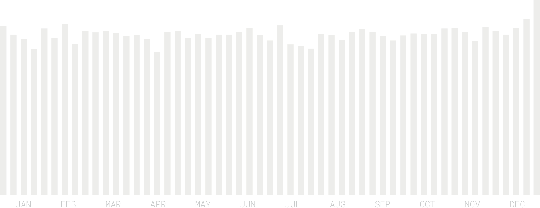
This is partly due to the lack of a proper desk setup at home – but probably also driven by less physical activity overall. My Fitbit reports a 22% decline in the average amount of steps since the start of quarantine (Daily Average: 10,964 → 8,510).
fig 04Number of Steps
Even more importantly, covid-19 has killed my 180 weeks swimming streak. I can’t wait until swimming pools are allowed to open again.
fig 05Swim Distance
04 Movement
Walking and swimming aren’t the only modes of transport impacted by the lockdown – my public transport consumption has also come to an almost complete halt (with the exception of a doctor visit that required it).
fig 06Number of Rides by Mode of Transport
A positive side effect of spending more time at home is being exposed to less air pollution. The average AQI level of my first five weeks of quarantine was 21% lower than the average of the previous five weeks when things were still normal (Average AQI: 25.26 → 19.91).
fig 07Average AQI Exposure
05 Media Consumption
Another positive side effect has been the additional time I get to spend reading. My book consumption has quadruplet since the start of the lockdown (Average Daily Reading Time: 15min → 77min).
.
fig 08Reading Time
Audio-based forms of media consumption, on the other hand, have seen a decline. My podcast listening time has gone down by almost 40% (Average Daily Listening Time: 23min → 14min).
fig 09Podcast Listening Time
My music consumption has also decreased by 40% (Average Daily Number of Songs: 23 → 14).
fig 10Number of Songs Listened To
06 Eating & Drinking
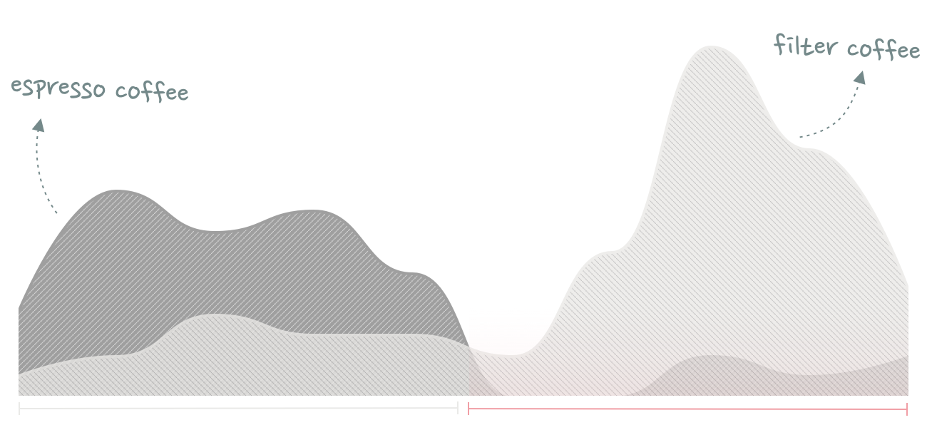
Since I don’t have a coffee machine at home, the number of espresso-based drinks I’ve been consuming has gone down dramatically. Instead, I finally get to use my Chemex and Aeropress more often – resulting in a 231% increase in filter coffee consumption.
fig 11Coffee Consumption
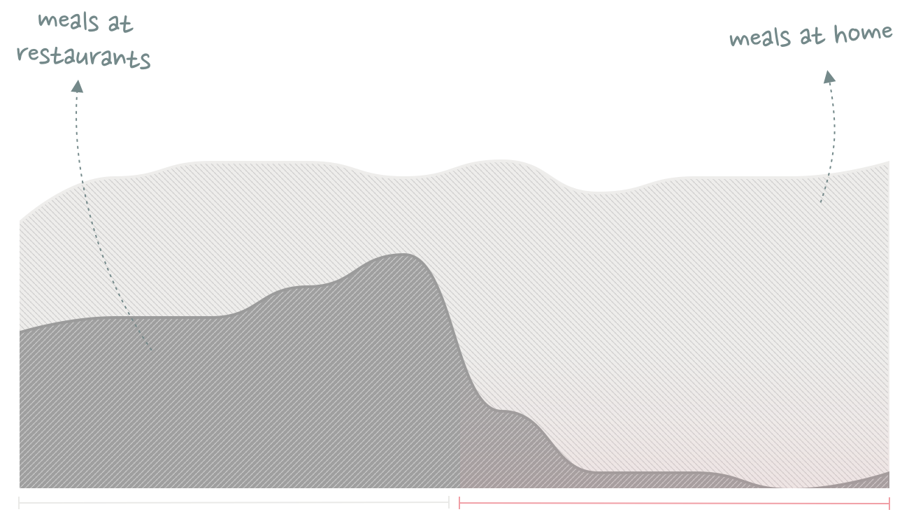
Apart from the occasional pizza I pick-up at the Italian place in the neighborhood, my food consumption has also almost completely shifted to home-made meals.
fig 12Number of Meals by Location
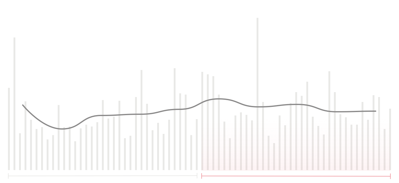
Relatedly, my number of Swarm check-ins has also decreased by 56%.
07 Screentime
Being confined to my own home has resulted in more phone screen time (especially social media apps). I now spend an average 151 minutes per day looking at my phone, compared to 131 minutes before the lockdown – a 15% increase.
As part of my ongoing work on a personal operating manual, I’ve been thinking a lot about what Tyler Cowen would call the “Julian Production Function”. Namely, a list of all the habits, routines and things that make me more productive.
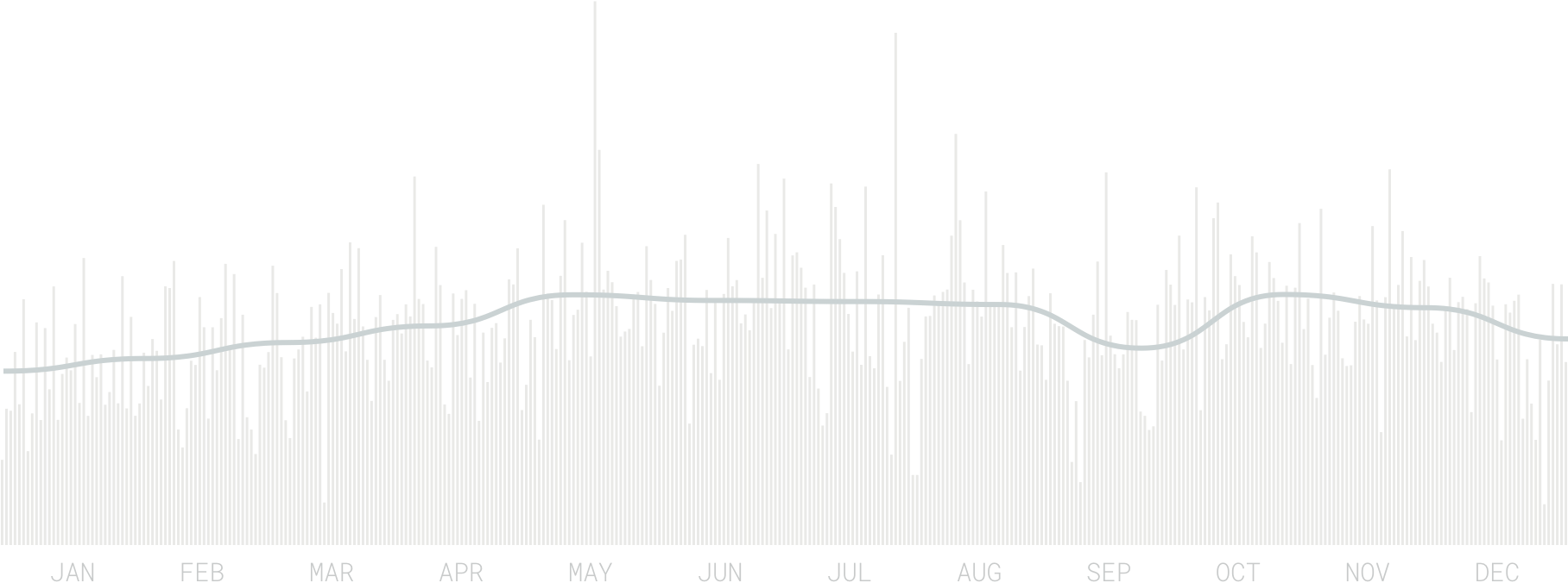
One element of my personal production function I find particularly interesting is the impact of music (or audio more general) on my productivity.
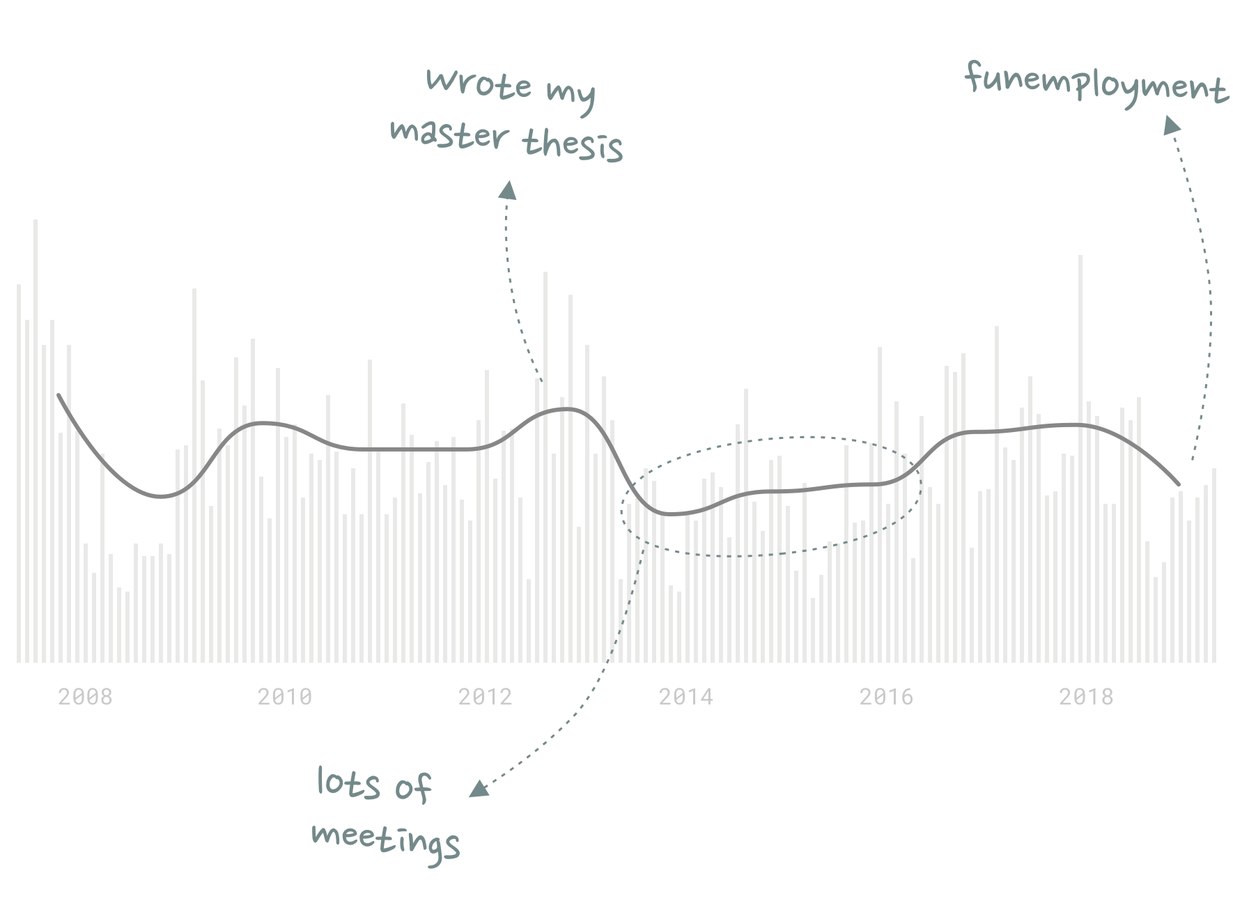
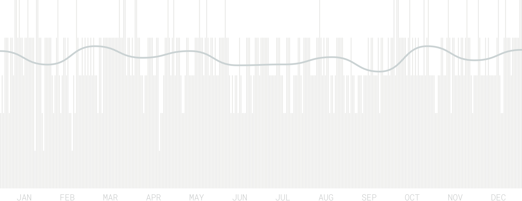
Based on almost 15 years of Last.fm data, I know that music consumption overall is a pretty good proxy to measure my productivity. The graph above shows the number of songs I listened to on a monthly basis (the gray bars) as well as the monthly average per year (the black line).
My music consumption peaked in years where I did lots of deep work such as studying, writing or coding (2008, 2010, 2013, 2017-2018). Years with less screen time correlate with a lower number of songs I listened to (2014-2016, 2019).
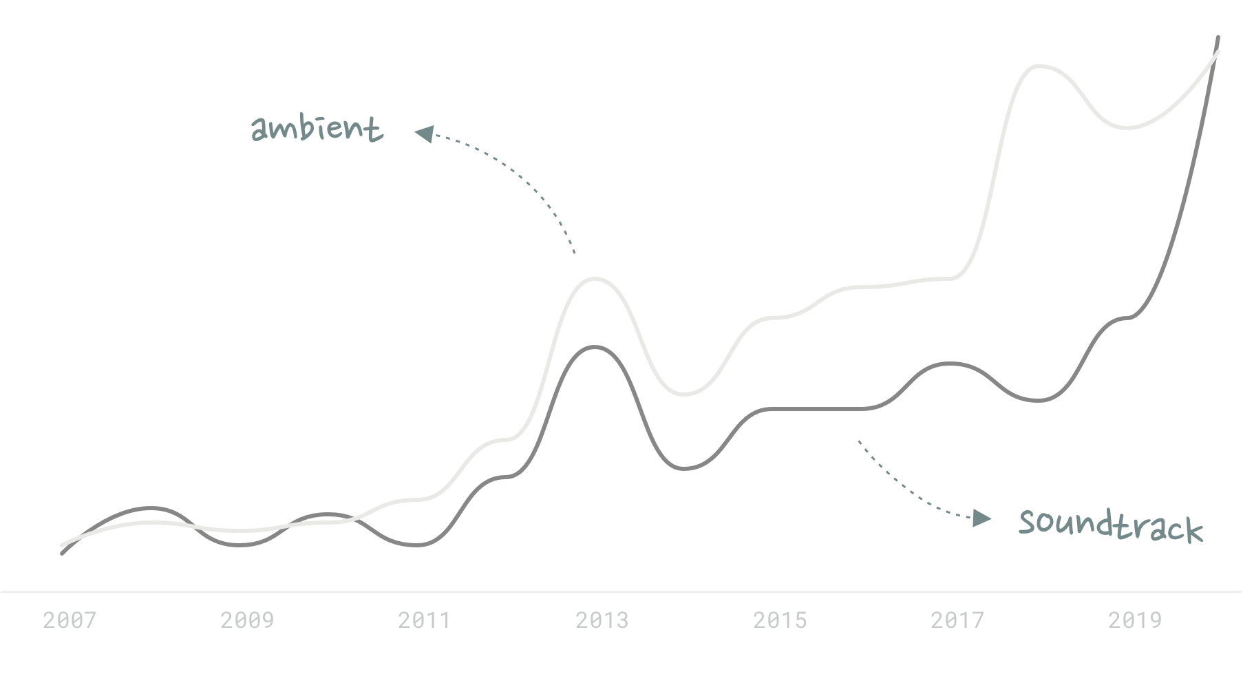
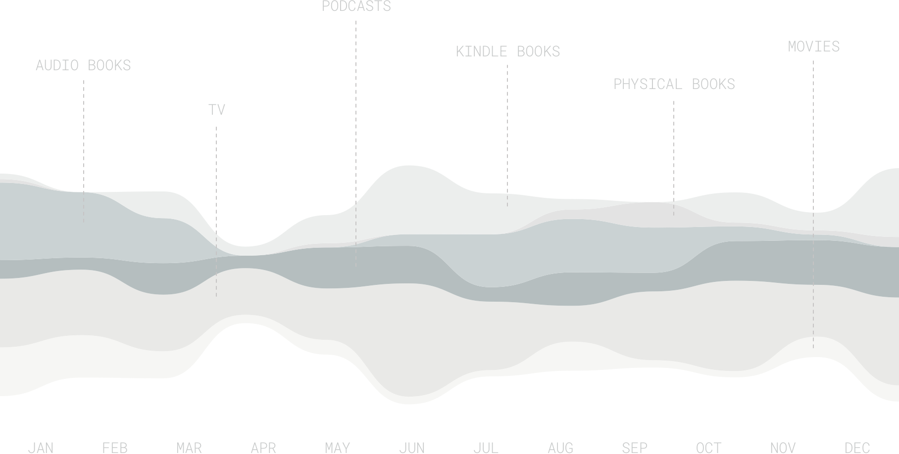
Of course not every type of music is necessarily great for productivity. When I dug a little deeper into the data I found another interesting trend: Over the last ~10 years, I have increasingly listened to ambient music and soundtracks. These two graphs essentially represent my efforts to optimize my music consumption for further productivity improvement.
The problem is that I haven’t found a good way to measure if (or which of) those attempts to improve my productivity have actually paid off. More music consumption tells me that I worked more – but it doesn’t tell me if I worked better or more efficiently.
It’s hard to quantify actual productivity or focus work: I’ve tried using productivity proxies such as RescueTime, number of emails sent and GitHub contributions – but all of those are pretty vague. Rating each day with a “perceived productivity”-score also hasn’t really produced any meaningful data.
Nevertheless, I will continue to experiment with different music to improve my focus. Here’s a list of music apps and playlists I’m currently using:
NATURE SOUNDS You can find endless nature sound playlists on Spotify and YouTube. I prefer thunderstorm and rainforest sounds. Noisli is great to mix and match different sounds.
LO-FI ANIME BEATS / CHILLHOP I’m subscribed to ChilledCow and Chillhop Music on YouTube, but to be honest this type of music has never really worked for me.
FOCUS MUSIC APPS My go-to productivity app these days is a service called Endel which “creates personalized, sound-based, adaptive environments that help people focus and relax” based on a variety of inputs (including time of day, weather, heart rate and location). I have also heard good things about Brain.fm and focus@will.
Last but not least, Flow State is an excellent newsletter that sends you a daily focus music recommendation.
The number one question I get asked on Twitter these days is how I get the data for my media consumption posts and quantified self reports. So I thought I’d dedicate this week’s post to explain my tracking setup.
I got into self tracking in the early 2000s when I first discovered HistoryStats – a Miranda plugin that gave me interesting statistics about my messaging behavior (who I talked most often to, what words I used the most, etc). A few years later, Audioscrobbler (which is now last.fm) allowed me to get similar statistics about my music habits. I also started to keep logs of books and movies that I had read and seen.
Inspired by the work of Nicholas Felton, I later began to quantify all sorts of other activities. My 2013 Quantified Self report – my most comprehensive tracking project so far – included data such as: How much I walked, drank, ate and slept. How many people I talked to. How many buildings I entered. I even tracked how much time I spent in the shower and brushing my teeth.
At the beginning, I always carried a little notebook around with me to write down things as they happened, but over time I got into the habit of simply being more present and remembering the core activities I wanted to track, so I could digitize them later. Even activities such as reading books I now consciously quantify and memorize while I’m doing them.
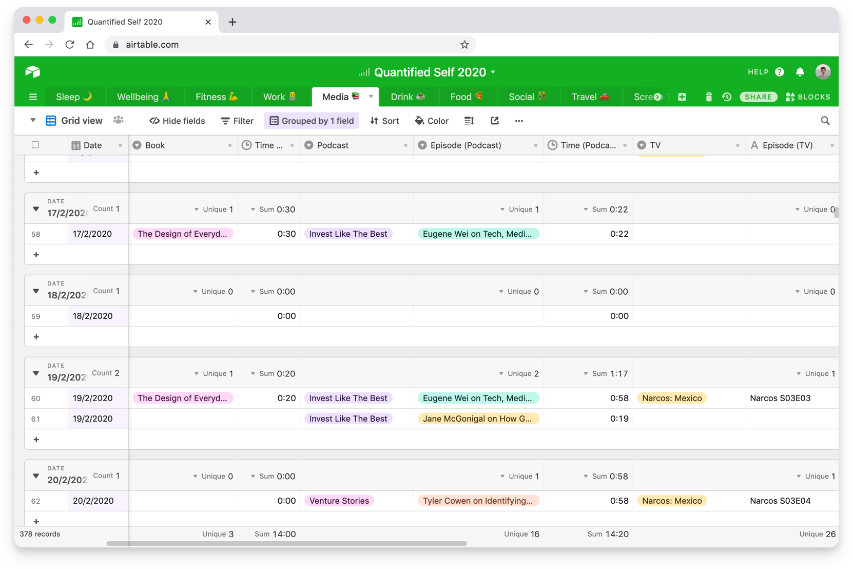
I currently use an Airtable spreadsheet for the vast majority of my QS activities, which I update about once or twice a day.
My 2020 tracking sheet looks like this: I have 10 spreadsheet tabs – one for each tracking category. These include Sleep, Wellbeing, Fitness, Work, Media, Drink, Food, Social, Travel and Screen Time.
Each tab then has a variety of metrics that I update on a daily basis. This is my current structure:
Sleep 🌙
↳ Bed Time (hh:mm)
↳ Wake Up Time (hh:mm)
↳ Perceived Sleep Quality (1-5 rating)
↳ Sleep Location
↳ City (single select)
↳ Location type (single select: home/hotel/…)
↳ Nightmares (y/n)
↳ ██████ ██
Wellbeing 🙏 ↳ Perceived Happiness (1-5 rating) ↳ Perceived Stress (1-5 rating) ↳ Perceived Overall Healthiness (1-5 rating) ↳ How Worried am I About the Future? (1-5 rating) ↳ Perceived Backpain (1-10 rating) ↳ Illnesses (multi-select) ↳ ██████ ██ ↳ ███ ███
Fitness 💪 ↳ Meditation (hh:mm) ↳ Back Exercise (y/n) ↳ Stretching (y/n) ↳ Swimming ↳ Swim distance (meters) ↳ Swim time (hh:mm) ↳ Push-ups (number) ↳ Plank (duration in minutes) ↳ Other Sports ↳ Sport (single select) ↳ Duration (hh:mm)
Work 💼 ↳ Start Time (hh:mm) ↳ End Time (hh:mm) ↳ Work Type (single select: work/writing/…) ↳ Work Location (single select: home/office/coworking/…) ↳ Perceived Productivity (1-5 rating) ↳ Perceived Job Happiness (1-5 rating)
Media Consumption 📚 ↳ Kindle Books ↳ Book Title (single select) ↳ Reading Time (hh:mm) ↳ Physical Books ↳ Book Title (single select) ↳ Reading Time (hh:mm) ↳ Audio Books ↳ Book Title (single select) ↳ Reading Time (hh:mm) ↳ Podcasts ↳ Podcast Show (single select) ↳ Podcast Episode (single select) ↳ Listening Time (hh:mm) ↳ TV ↳ TV Show (single select) ↳ TV Episode (single select) ↳ Watch Time (hh:mm) ↳ Soccer ↳ Teams (multi-select) ↳ Goals (number) ↳ Watch Time (hh:mm) ↳ Movies ↳ Movie (single select) ↳ Watch Time (hh:mm) ↳ Games ↳ Game (single select) ↳ Play Time (hh:mm)
Social 👫 ↳ In-person Conversations ↳ Partner (y/n) ↳ Close Friends (y/n) ↳ Friends / Acquaintances (y/n) ↳ Co-worker (y/n) ↳ Other (y/n)
Travel 🚗 ↳ Did I use this mode of transport today? ↳ Plane (y/n) ↳ Car (y/n) ↳ Subway (y/n) ↳ Taxi (y/n) ↳ Tram (y/n) ↳ Train (y/n) ↳ Bus (y/n) ↳ Scooter (y/n) ↳ Boat (y/n) ↳ Other (y/n)
Screen Time 📱 ↳ Total Phone Screen Time (hh:mm) ↳ Time Spent in Social Apps (hh:mm) ↳ Phone Pickups (number) ↳ Notifications Received (number)
While this might sound like a lot of work, it doesn’t actually take a lot of time to fill out the sheet each day. I probably spend less than 5 minutes per day in my Airtable spreadsheet.
In addition to my tracking sheet, there are a few metrics that are calculated (semi) automatically:
Number of Articles Read Whenever I finish reading an article I add it to Pocket with a specific tag. Every article (title, URL) then automatically gets added to another Airtable spreadsheet via IFTTT.
Music Behavior Last.fm tracks every song I listen to.
Fitness and Sleep Data I have a Fitness Alta that tracks the number of steps I take and how active I am. It also tells me how long and well I slept.
Location Data I check into every single place I visit with Swarm. I also have constant location tracking turned on in Google Maps, Gyroscope and Zenly. None of these always-on services is particularly great – I really miss Moves App.
Screen Time I use Screen Time on my iPhone and RescueTime on my laptop. I wish Apple would release a Screen Time API so that I didn’t have to manually copy data from the app to Airtable.
Air Quality The Plume Flow 2 is the latest addition to my quantified self setup. This is a mobile air pollution sensor that measures Particulate Matter (PM1, PM2.5, PM10), Volatile Organic Compounds (VOCs) and nitrous oxides (NO2).
I’m thinking about upgrading to a newer fitness tracker with a heart rate monitor or a more sophisticated sleep tracker like the Oura Ring. It would also be interesting to move to a sort of tracking bot that randomly asks me questions through-out the day (see Felix Krause’s LifeSheet or Reporter app) to avoid peak-end bias.
Eventually, I’d also like to build a dashboard that combines my Airtable spreadsheet with my yearly goals and gives me real-time reminders and statistics about my routines and habits – but this is for another article.
This is my quantified self report for 2018. Since 2013 I’ve been tracking various life metrics to learn more about myself and improve my productivity, health and well-being. Last year I kept track of about 50 metrics across 5 categories. Some data are captured automatically via applications such as Last.fm (music), Fitbit (steps, sleep), RescueTime (productivity) or Moves (location) – I log the rest manually in a Google Sheets spreadsheet.
>_ Physical Activity
fig 01Steps per day & Monthly Average
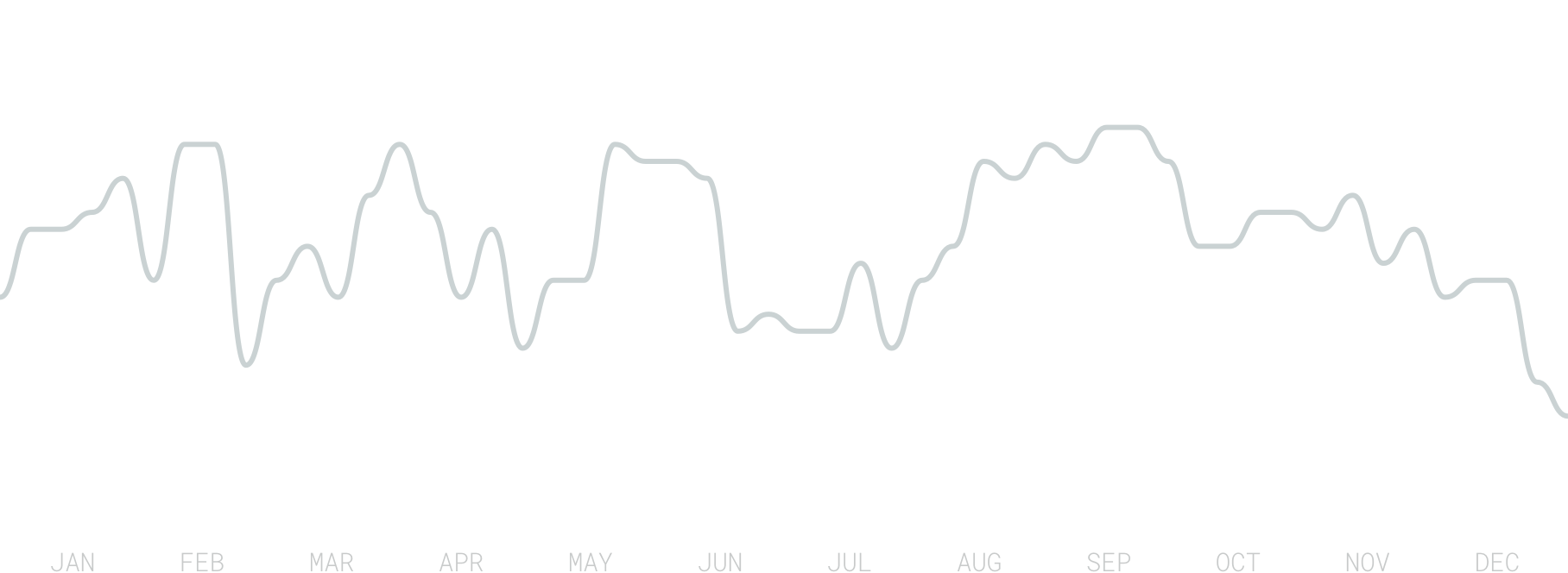
I took a total of 4,477,138 steps last year, which is an average of 12,226 steps per day. My most active day was May 19 with 30,147 steps. On 88 days I didn’t hit my daily step goal of 10,000. I walked less than average in colder months of the year (Jan-Apr, Dec). You can also see a dip in September where I was down with the flu for about a week.
fig 02Swim distance per week
My 2018 goals included going for a swim at least once per week and increasing the total swim distance. I didn’t miss a single week in 2018 and I swam a total of 128.5 kilometers which is a 27% increase compared to 2017. I swam in 6 different pools and 1 lake across 6 different cities in 4 different countries. The London Acquatics Centre was the nicest pool I swam in this year.
>_ Media Consumption
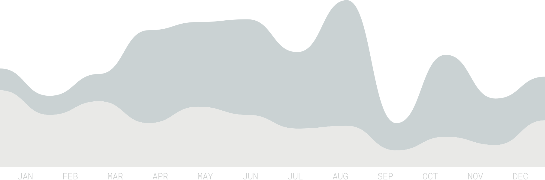
fig 03Time spent per medium per month
I consumed a total of 30 books last year of which I finished 18 (60% completion rate). I read 11 books on my Kindle (55% completed), 6 in paper format (33% completed) and listened to 13 as audiobooks (77% completed).
I spent 73.5 hours reading books on my Kindle, 14.5 hours reading paper books and 89 hours listening to audiobooks. That an average of roughly 29 minutes of book consumption per day.
Listening to 84 podcast episodes took up 85 hours of time last year, while watching TV and movies made up 193 and 56 hours, respectively.
Additionally, I read 361 long-form articles.
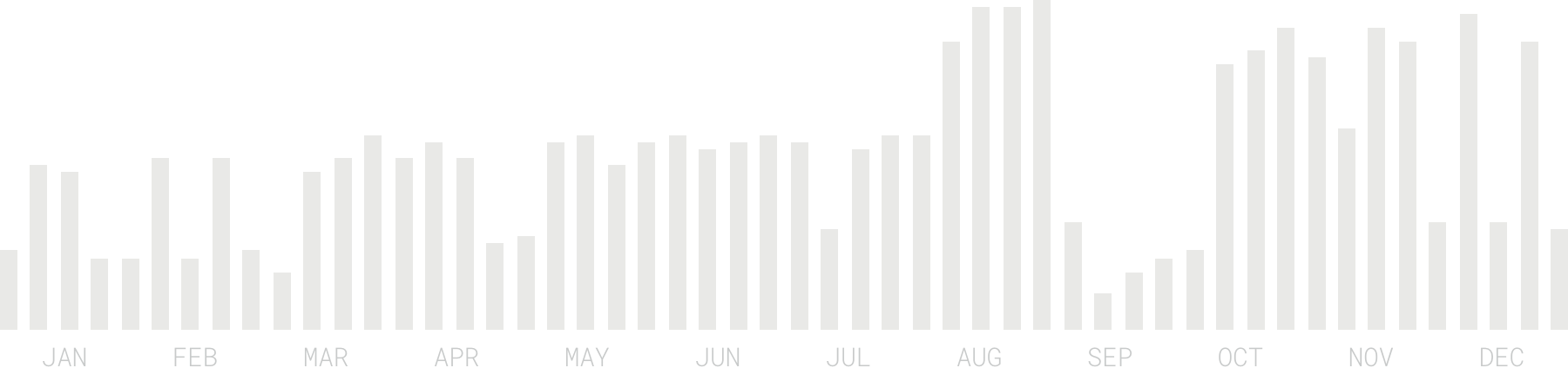
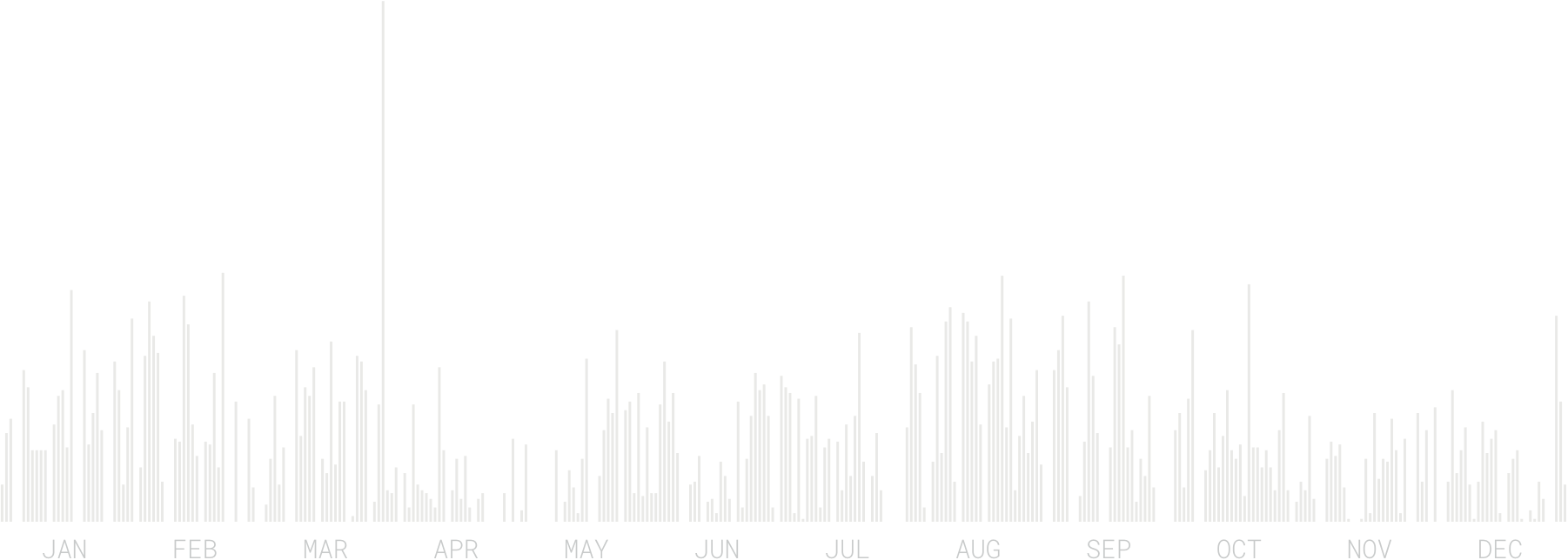
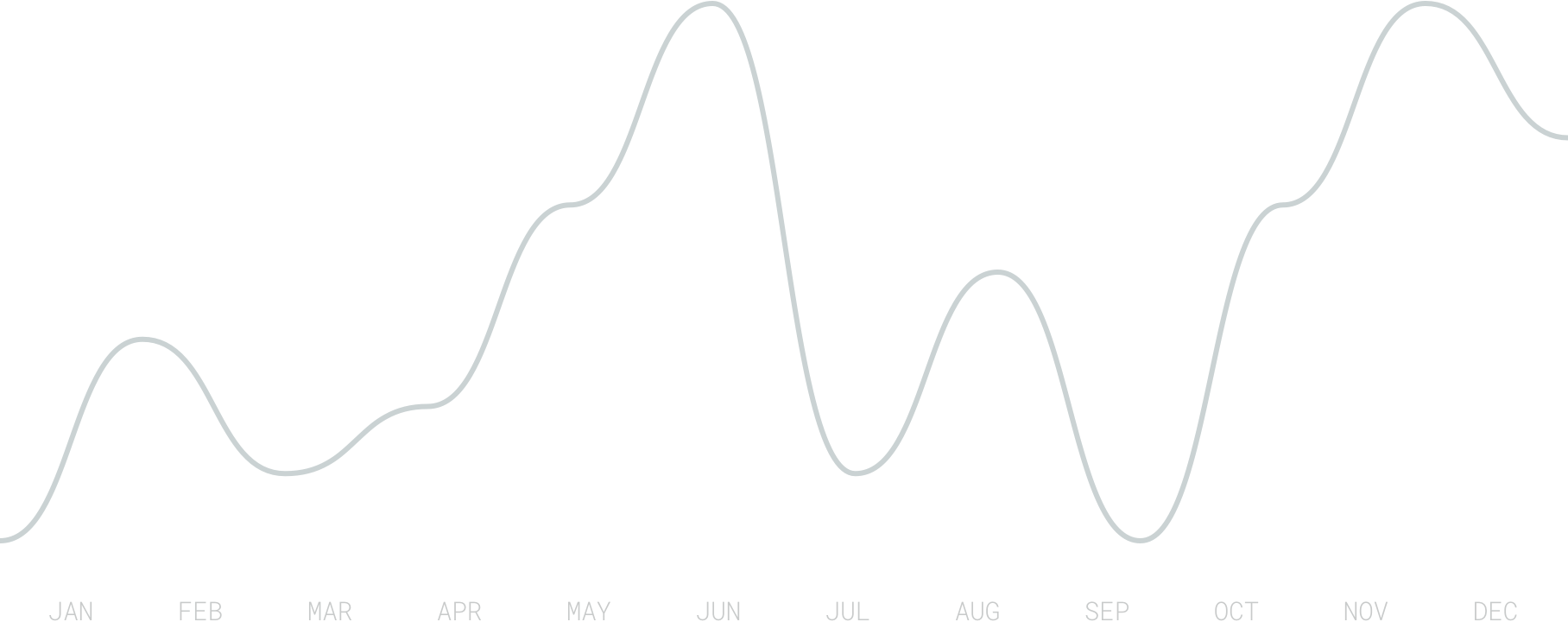
fig 04Number of songs per day
I spent 21 days and 10 hours listening to 8.820 songs (of which 3.334 were unique) from 1491 different albums by 930 different artists.
I haven’t consumed this much music since 2013 (9403 songs), which is a positive sign since I suspect that music consumption is a good proxy for productivity (my job between 2014-2017 was quite meeting-heavy).
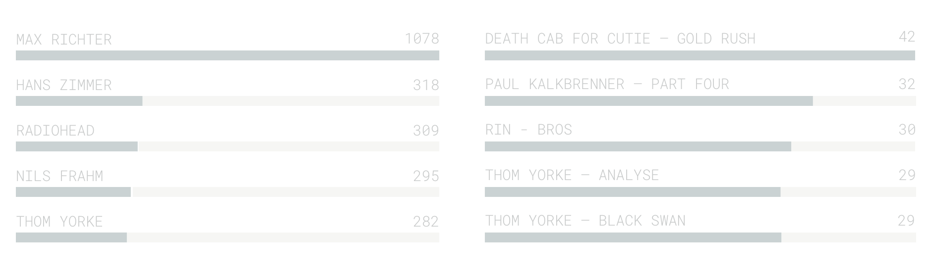
fig 05Most popular artists & songs
More than 60% of the songs I listened to last year were electronic, ambient or contemporary classical music (ideal for productive work). I listen to most music on Fridays (a day that usually has less meetings).
Exactly half of the music I consumed were songs I listened to for the first time.
>_ Travel
I traveled 12,626 kilometers last year visiting 15 cities in 5 countries (DE, AT, CH, PL, GB). I spent the vast majority (+90%) of my time in Berlin:
fig 06Berlin Movement patterns Yellow: Walking / Red: Public Transport, Car, Taxi
I visited roughly 5 places per day (down 7% YoY) and explored 633 new locations that I hadn’t been to before.
>_ Nutrition
fig 07Coffee consumption over time Dark gray: Filter / Light gray: Espresso
I had 471 cups of coffee last year. 58% of which were filter-, 42% espresso-based.
fig 08Beer consumption per month
I drank 113.85 liters of beer last year (which is less than I drank in 2017, but still above the average per capita consumption in Germany).
fig 09Beer consumption vs. Soccer vs. Temperature Left: Soccer Games (in min) / Right: Average temperature (in °C)
I compared the data to the time I spent watching soccer and the average temperature, which are the two factors I assume have the highest influence on my beer drinking behavior.
fig 10Old Fashioned’s consumed per month
As if the number of beers wasn’t concerning enough, I additionally had 43Old Fashioned’s and 101 glasses of wine. (I decided to cut down my alcohol consumption this year.)
I ate 12 bowls of Ramen, 15 Burgers, 14 Gemüsekebabs, 7 Bibimbaps, 2 Poke Bowls, 4 Schnitzels, 78 slices of Pizza and 82 dishes of Pasta.
I limited my meat consumption to 24 meals, but had fish or seafood on 83 occasions.
>_ Wellbeing
fig 11Perceived Happiness Daily Scores + Monthly average
I rate each day on a scale of 1-5 with 1 being “Very Unhappy” and 5 being “Very Happy”. I evaluate this in the morning of the next day. I’m aware that this method far from perfect (recency bias, etc) and will probably switch to a tool like Felix Krause’s Mood Tracker.
My average happiness score last year was 3.49. March and October were my happiest months, but I don’t have a good explanation for why this is the case.
I keep similar scores for Perceived Stress (1 = Very relaxed, 5 = Very stressed), Perceived Sleep Quality (1 = Hardly slept, 5 = Slept really well) and Perceived Back Pain (1 = No Pain, 10 = Very Painful).
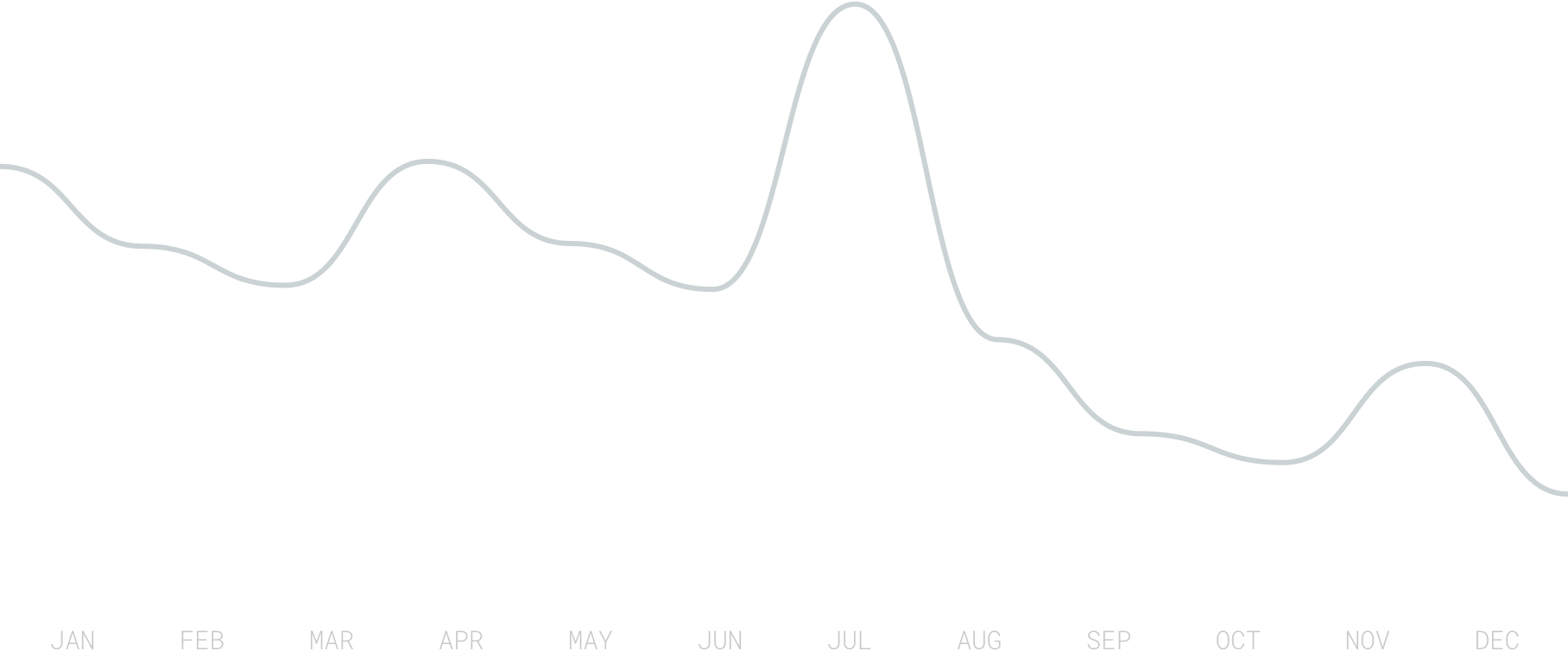
fig 12Perceived Stress Weekly Average
On average I reported a daily stress level of 2.47. Unsurprisingly, weekends were less stressful (1.69) than work days (2.78). My stress levels also decreased whenever I took a vacation.
fig 13Time Asleep Weekly Average
I spent 2859 hours and 50 minutes asleep last year. That’s 32.64% of the entire year or 7:50 hours per day.
fig 14Perceived Sleep Quality Left: Monthly Average | Right: Weekday Average
I reported an average daily sleep score of 3.68. I slept best in March (4.03) and in nights between Thursday to Friday (3.92). May (3.26) and nights between Sundays and Mondays (3.36) received the lowest perceived sleep quality scores.
fig 15Perceived Back Pain Weekly Average
After suffering from chronic back problems for a few years, I started tracking my pain levels in 2017 to get a better understanding of which treatments actually had a positive impact.
In 2018, my average reported daily back pain was 1.45 – down from 4.2 in 2017.
fig 16Backpain vs. Swim Distance vs. Stationary Time Left: Swim Distance | Right: Stationary Time
I compared my back pain numbers to my swim activities (which seem to have some impact) as well as the time I spent stationary (no physical activity).
>_ Productivity
fig 17Time Spent on Computer Weekly Duration
I spent 1709 hours in front of my MacBook last year – that’s 19.51% of the entire year.
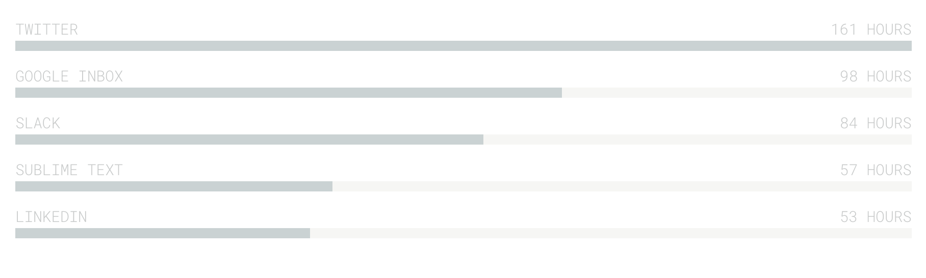
fig 18Top Activities Time spent per application / website
Twitter was by far my most used application in 2018: I spent (wasted?) a total of 161hours on the platform last year (note that this doesn’t include phone screen time).
98 hours were spent reading and writing emails in Google Inbox – my second most used app last year. I switched to Superhuman at the end of last year and I’m curious if my 2019 data will support the company’s promise of making email faster and more efficient.
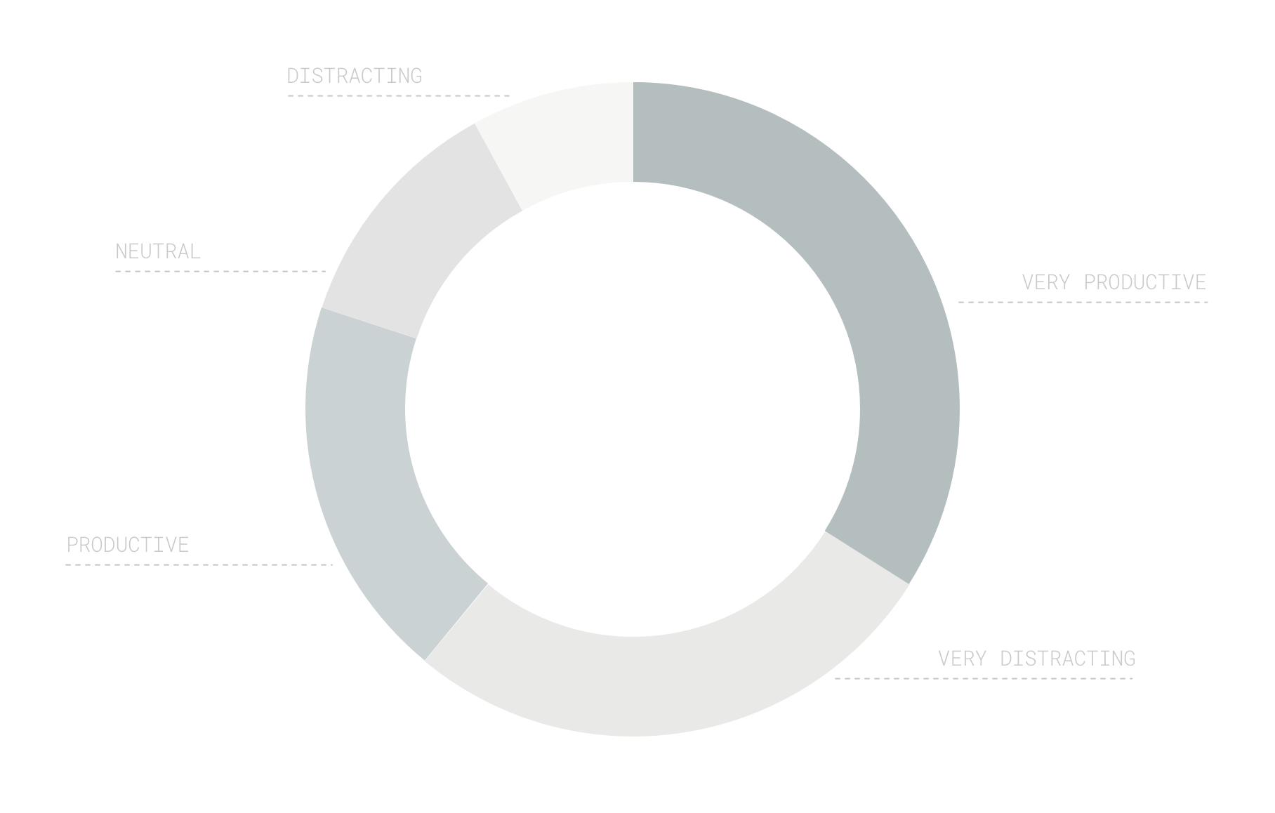
fig 19Productivity Scores Time spent per category
Every app and website is tagged with a productivity label ranging from Very Productive to Very Unproductive. I spent the majority of the time (907 hours) doing either Very Productive or Productive work. 602 hours were marked as Unproductive or even Very Unproductive.
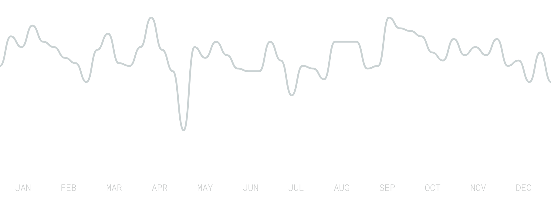
fig 20Productivity over time Average Weekly Productivity Score
Based on the applications’ productivity labels and the time I spent in them, a productivity score between 0 (Very Unproductive) and 100 (Very Productive) is calculated. My overall 2018 productivity score was 56 – down from 62 in 2017.
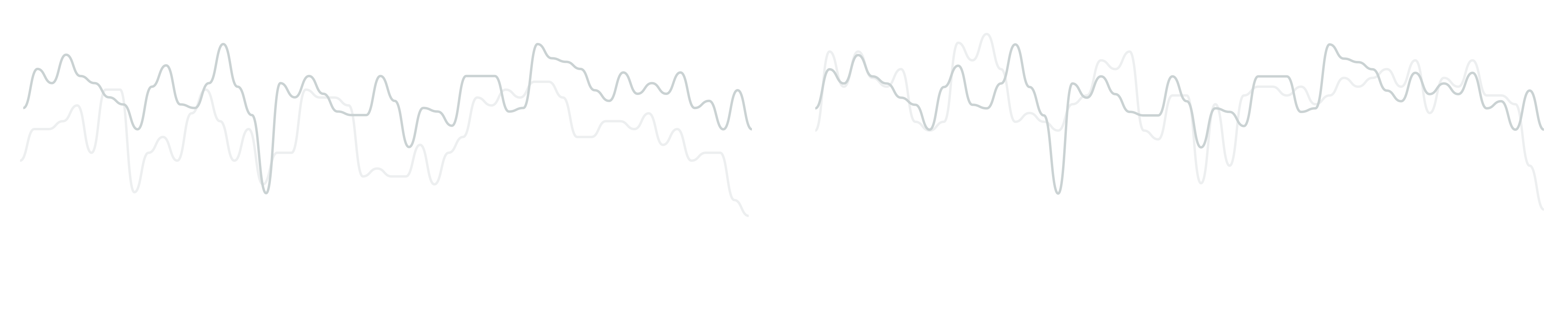
fig 21Productivity Scores vs. Perceived Stress vs. Perceived Productivity Left: Perceived Stress | Right: Perceived Productivity
My productivity score follows a similar pattern to my perceived stress levels as well as my perceived productivity (which is an additional 1-5 score with which I rate each working day manually).
>_ Meta
I worked on this report for 13 hours and 25 minutes 🙂
Time frame: Oct 27 – Nov 10 (340 hours)
Number of steps: 141706 (-27% compared to Budapest)
Modes of transport: 5
Coworking spaces visited: 2
Coffees consumed: 8 (-55%)
Productivity score: 65% (+1pp)
Tools: Moves & Mapbox Yellow: Walking Red: Transport